|
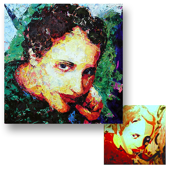
I have always had a love of color. As a painter, color is something I struggle with on just about every painting. Even when I think I have a color combination dialed in there are still constant tweaks that need to be made in the process. It is very rare that I apply a mixed color on canvas and have it react exactly the way I want it to when placed next to the other colors. Revision and experimentation are a must. In my early days as a painter I was using color directly out of the tube, which my mentors/professors/colleagues found garish. My painting “Obscured” is a good example of what was, at the core, merely experimentation with ideas found in Impressionist and Pointillist works (although much less successfully executed, from my perspective now). I have attempted to paint in ways that were less vivid with muted tones. With certain subjects this might be necessary, but I was always somewhat unhappy with the results. What I have learned, since painting “Obscured,” is that colors can be made to appear more intense by placing muted colors next to them, not necessarily using colors straight out of the tube. What I have found over the years, and returned to recently, is the use of vibrant underlayer colors that are allowed to peek through the final paint application, whether working in layers or strictly all prima. This is something I have been experimenting with more and more, lately. I will post a few of my works in the upcoming weeks that I feel have utilized this idea somewhat successfully.
0 Comments
Your comment will be posted after it is approved.
Leave a Reply. |
AuthorScott Anstett is a American artist, teacher, and avid cyclist living in the Pacific Northwest. Categories
All
Archives
October 2022
|

 RSS Feed