|
Matting paper and panels can be incredibly simple. #1. Create your work. #2. Take your work to a frame shop and have them professionally mat it. They can even install it in a frame of your choice. The problem with this, for me, is that I am a small business that struggles to maintain a good flow of revenue, and professional framing services can be quite expensive. These are some of my methods for making your work more presentable while keeping costs low.
0 Comments
Living abroad forced me to scale down the size of my paintings. I had very little storage space and my production level rose to the point that I was creating paintings faster than I was selling them. I started using paper for experimental works, but after developing a suitable prep method with what I had available to me, paper quickly became a viable option for smaller works.
It can be difficult enough to find images or ideas that inspire an artist to create art. Commission work can supply the inspiration, but what if the image itself has an emotional aspect that interferes with the creative process? This is how I moved forward on one such piece.
Follow me on a small part of my adventures in Berlin and Potsdam as I check out some local museums for a few different types of inspiration.
Check out some of my early painting experiments with different colored backgrounds. Although these seem a bit crude and cartoonish, in retrospect they have influenced much of what I do today in establishing an overall tone or "feel" to my paintings.
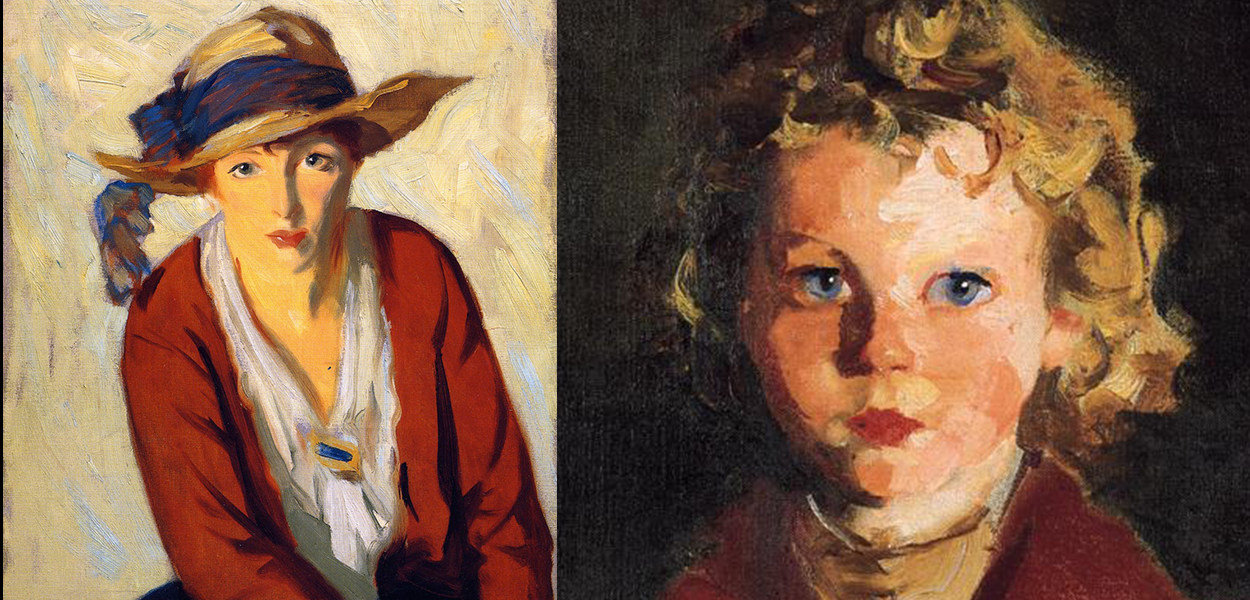
Robert Henri paintings: The Beach Hat on the left (1914) and Rosaleen on the right (1928) I admire the use of bold color in a painting that is seemingly out of place or too intense when viewed up close but pulls together into a convincing form when viewed from a few steps (or more) away from the work. Robert Henri would use dabs of intense color in noses, ears, and the inner eye quite frequently in his portraits. My admiration for his work made me want to use color in a similar fashion.
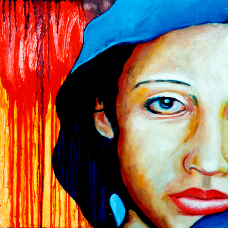
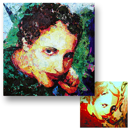
“Feis" 2’ X 2' Oil on canvas. 2006
Realistic rendering of the human figure had been of interest to me for a long while, and something I was able to indulge in at PAFA. I still was not certain how I could incorporate some of the methods I learned into my own art. I wasn’t interested in replicating old masters works or even painting in their style, but I was interested in using a more figurative approach. Feis was a break from the simplified, unblended, palette knife work. I worked on a smaller canvas, but wanted to give the work the same punch as the larger so I chose a bright background and stuck with mainly prismatic colors. This was also the first time I employed a model I’d previously painted, who’s androgynous nature I found fascinating, amazingly beautiful, and most worthy of an exploration in painting. To purchase a reproduction of this work visit my online store at https://society6.com/product/feis_print#s6-770079p4a1v46 “Bulletproof” 4’ X 4' Acrylic and Oil on canvas. 2006
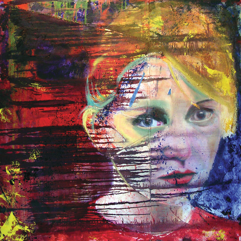
Heavily influence by the model, “Bulletproof” represents a young student of mine who possessed far more depth of character than her outward appearance might suggest. It was my first exposure to working with a young person who I discovered to have suffered emotional abuse by adults that she should otherwise have been able to love and trust. The painting became much more about her psychological state than merely her physical. I was slowly incorporating more of my learning from PAFA and rendering the figure in more realistic fashion, while maintaining my use of prismatic colors and simplified imagery broken down into shapes. This was also created in a new studio space large enough to allow me to actually throw, splatter, dribble, and dump paint on the canvas at will. To purchase a reproduction of this work visit my online store at https://society6.com/product/bulletproof-vbp_print#s6-875398p4a1v46 I have always had a love of color. As a painter, color is something I struggle with on just about every painting. Even when I think I have a color combination dialed in there are still constant tweaks that need to be made in the process. It is very rare that I apply a mixed color on canvas and have it react exactly the way I want it to when placed next to the other colors. Revision and experimentation are a must.
|
AuthorScott Anstett is a American artist, teacher, and avid cyclist living in the Pacific Northwest. Categories
All
Archives
October 2022
|
 RSS Feed