|
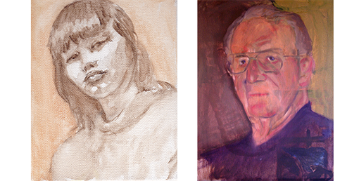
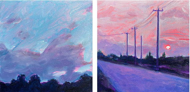
Check out some of my early painting experiments with different colored backgrounds. Although these seem a bit crude and cartoonish, in retrospect they have influenced much of what I do today in establishing an overall tone or "feel" to my paintings. I began my journey into painting in the mid 1980’s using pre-gessoed white canvas and establishing the drawing as I would any other drawing, just using paint instead of graphite or ink. My training in Alla Prima style painting under Al Gury at the Pennsylvania Academy of the Fine arts had me coating the canvas with a thin umber imprimatura background where I would wipe out areas of light and paint in darker areas to establish the basic form’s tone and mass. I worked with a beige or umber background for many years, until I started working on wood in 2015. A couple of my early sketches for paintings started with an imprimatura, a light umber coating that is then wiped away and drawn into to establish form and mass. As my work production increased I started posting work to social media and, subsequently, following other artists. I was a bit overwhelmed by all the amazingly good work being created every day and found that other artists use of color was of particular interest to me. I was thumbing back through Patti Mollica’s book Color Theory one day and connected her color-toned background section to some art I had recently been exposed to. Seemingly random colors where used to establish basic values and then allowed to bleed through to create a work that appeared a bit more polychromatic rather than purely tonal. I like to hop back and forth between tonal and polychrome color applications in my own work, whatever treatment I feel the subject needs or that I might be motivated to paint. I sometimes start with a wipe-out method on canvas, and direct placement or color blocking on wood or other absorbent materials. This method of assigning colors to values fascinated me and I decided to give it a try. My first question I needed to explore was how to know what colors to pick to give a desired effect? I started with some small landscapes just to get things rolling along. I found myself liking the paintings in this stage…fun and vibrant and a bit abstract. I believe this has already influenced my work in the way that I see color and shapes in images. I now evaluate images with this idea in mind when choosing a new image to paint. The finished paintings are below. Overall I’m pleased with the results. They are a bit “cartoonish” for my taste, but something very different than my previous efforts at landscapes. I’ll have to give it a go on a portrait, now. I still have a long way to go to develop the knowledge of what colors work well together and how to determine a color to use to give the overall “feel” to the piece that I desire. This has provided me with new inroads to creating landscapes and dealing with cloud formations and the intensity of sunrises and sunsets. These are all 20cm square and were all done very quickly (about an hour each in total) with a #4 & #6 hogs hair brushes and acrylic for underpaintings with oil over the top. There were ten of these in total. I have since created a couple larger versions that don’t allow the colors of the background to show through as much, but the process of creating them went much more quickly than my old approach. I recall, during a group critique at PAFA, a fellow student explaining to a professor that he was “experimenting” with his piece, to which the prof replied, “No, experimenting takes risks, and this is playing it safe. You’re just fucking around.” In the end I feel my experiment did what all truly experimental processes should do, and that is to move you forward with knowledge you gained from the process. It was fairly low risk, but a journey into unexplored territory that has left me wanting to explore more.
0 Comments
Your comment will be posted after it is approved.
Leave a Reply. |
AuthorScott Anstett is a American artist, teacher, and avid cyclist living in the Pacific Northwest. Categories
All
Archives
October 2022
|


 RSS Feed