|
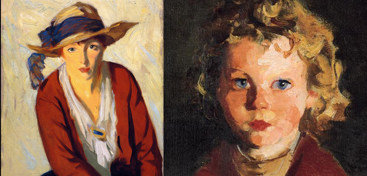
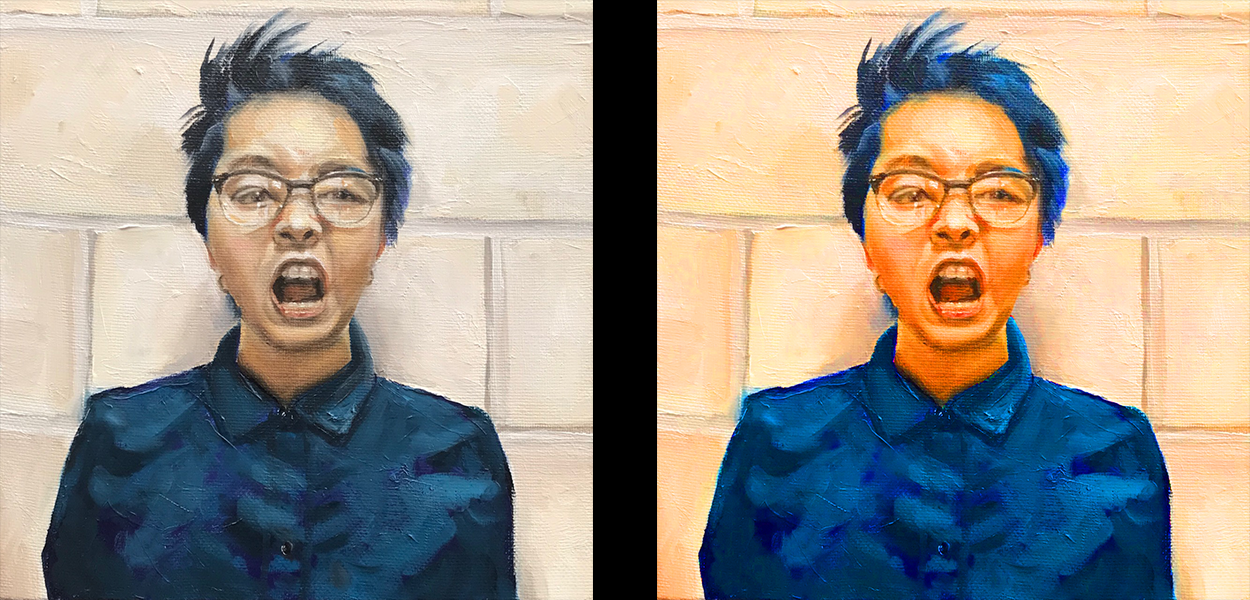
Robert Henri paintings: The Beach Hat on the left (1914) and Rosaleen on the right (1928) I admire the use of bold color in a painting that is seemingly out of place or too intense when viewed up close but pulls together into a convincing form when viewed from a few steps (or more) away from the work. Robert Henri would use dabs of intense color in noses, ears, and the inner eye quite frequently in his portraits. My admiration for his work made me want to use color in a similar fashion. This portrait is one of my most colorful, with the use of many colors straight from the tube. I would not have believed, at its start, that such intense colors could work well together, especially with an equally colorful background. Lately I have found myself desiring a more subtle use of intense color in my work. A change has begun, and with change must come experimentation. The above painting was a return to the idea I was exploring in “Obscured” (prior post) where I was attempting to allow a background color show through in areas and influence the top layers. I was pleased with the underlying intense purple-blue. Much of the basic under-drawing was completed in this color. The painting on the right has had the saturation increased so the hues stand out more clearly (some may not initially see the flesh tones or background as orange or some of the dark areas as truly blue). The intense under layer of blue is clearly visible when viewing the painting up close, but blends when viewed from a few feet away. My younger artist self may have preferred the saturated painting, but now I find myself pleased with the interaction of the underlying intense color with the muted Manganese Blue over the top and the interaction of the blues with the orange flesh tones. In the original image the shirt and hair were flat black, and although I liked the original image I felt the need to add more interest (and color, of course).
Even after decades of interaction with Henry’s portraits I feel I have made few inroads to understanding color as he did. I have come to understand that one could read every book on color and still not have a full understanding of its use in painting without practical application…which simply means work work work. Even with the work there is still a propensity to fall into familiar patterns when you find a color combination that you feel “works.” You develop a limited understanding based on your preferences and label that your style. So, with the goal of continual learning and growth as an artist, I have begun a series exploring the use of colored under layers to establish value and create interest, or simply add a tonal element, to the final work. More on that in the next post… To purchase a reproduction of my various artwork visit my online store at https://society6.com/scottanstett
0 Comments
Your comment will be posted after it is approved.
Leave a Reply. |
AuthorScott Anstett is a American artist, teacher, and avid cyclist living in the Pacific Northwest. Categories
All
Archives
October 2022
|


 RSS Feed